Friction by design
I watched a podcast episode with Jeff Atwood, the co-founder of StackOverflow and Discourse, and during the talk, they mentioned the idea of "friction by design". It was related to how StackOverflow was, in good part, intentionally making it harder to ask questions, giving you enough time to rubber duck-debug with yourself and perhaps even figure out answer without asking the question.
In the past few days I was thinking about this sort of UX choices a lot, but I was lacking the terminology to explain it concisely, and "friction by design" is just for that.
The problem that I was trying to solve was to somehow force users to actually spend a little bit of their time and attention during the onboarding process for Unfold Research. I wanted to keep things simple and flexible, and easy to develop for myself (so no third-party onboarding libraries with fancy graphics and UIs). I needed something that is quick and simple, but still manages to capture the key of the onboarding process.
Since I don't think that UI interface and controls will be unfamiliar to anyone (even with voting included), that wasn't the main that I was focusing on that I was trying to capture during the onboarding process. Instead, I was more interested in capturing a desired sentiment that will be associated with Unfold's community. The main ideas revolve around "kind community of experts exchanging solid information" - that's kind the crux of what Open Science is about as well.
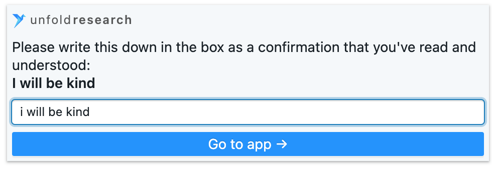
Now, the voting, and general functioning of the app,... you'd learn those things from wherever you came from to the app - you've read it on Twitter, or read the text on our landing page, or watched some video... But the thing that wasn't emphasized so far was exactly that sense of communal effort and its importance. So, the Onboarding section, which is a single page that you read through about rules and some of the general concepts (like voting), instead of having a mindless "Sir, yes, sir!" button that you automatically just click, has this at the end:
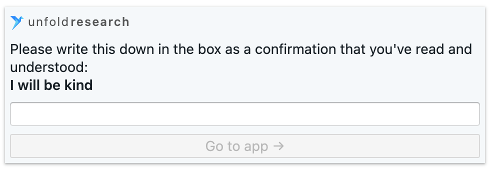
It's an input that actually forces you to stop for a minute, realize what exactly is being asked of you, and not only follow the instructions at the time being, but actually somewhat also "commit" yourself to doing things in a certain way in the future. I think it's very powerful. You're literally investing yourself, cognitively, emotionally and reputationally.
Only after you've typed this exact phrase do you get the chance to finish your onboarding.
I can't wait to measure the amount of churn in the funnel for just this step. :)
But that future commitment, I believe, will be a strong incentive to do less shitty stuff on the platform - you'd be lying to your former self in a very direct way; and that feels bad, and if it feels bad that you're doing a bad thing (by not being kind), then it should feel bad. I am fine with having less people that are more kind, than more people that are ruining the fun for everyone.
I borrowed this idea of typing confirmation from Github. When you try to delete a repository, they ask you to confirm the action in writing:
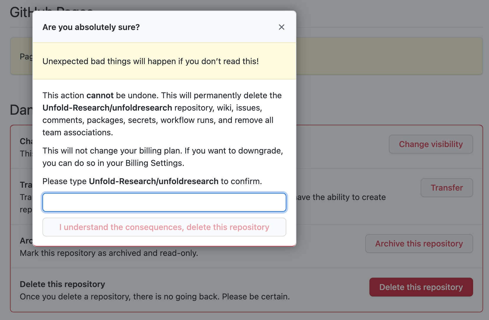
I've always found that solution quite elegant - more that just confirming that "indeed, you are sure", this solution is better simply because it gives you more time to internalize what it is exactly that you're doing, and just how important and irreversible that is. It has happened to me that while I typed out what was required I changed my mind and didn't proceed.
Github does it for safety purposes mainly. Deleting stuff is quite often a one-way street, so going down that path should be done with caution. But this idea of creating intentional friction for you to have more time to think about things was something that I also recognized in another place as well.
In this Twitter thread I explained that writing notes on a paper is useful because it's slower. And also, the additional time that you spend organizing things, such as during my management of nodebooks that I created (nodebook = digital notes graph), simply gives you more time to think about the things that you're working with just a bit more - helping you understand them better, internalize them and connect them in your head with other topics and amongst each other. Having that extra friction for now, will pay off long-term, by saving you time for recall or from totally forgetting things. Friction (by design) is actually what you want.
Should everything have more friction? I don't think so. Definitely a majority of actions should as quick as possible, because they deliver a straightforward value with known consequences and implications. But things that need to be internalized and well thought out, should have more friction built into them, simply because you'd be spending more time on them and allowing yourself to achieve exactly those goals.
I'm hesitant to say that "important things should have more friction built in", because for sure not everything deemed important needs it, nor that everything with friction is important. It depends on the purpose, and if the purpose is for somebody to be engaged in active thinking about a certain thing, with full focus and attention, then yes, do enable that through built in UX friction.